About Keystone Bank – Brand Refresh and Ongoing Design
As Keystone Bank prepared for its next phase of growth, their rapidly expanding presence and construction of a new headquarters required a visual identity that reflected the high-end experience clients already knew and trusted. With a discerning audience of entrepreneurs and business owners, Keystone partnered with us to elevate the brand and align it with a more sophisticated, luxe direction.

“The best decision we ever made as an organization was hiring Zilker Media. They are huge partners of ours.”
JEFF WILKINSON
Chairman and CEO, Keystone Bank
Keystone Bank – Brand Refresh and Ongoing Design
The Challenges
Brand Refresh and Ongoing Design
Building on years of collaboration, Zilker Media guided Keystone Bank through a strategic brand evolution, crafting a refined, modern identity that better reflected their premium service experience and future growth vision.
The Solution
The Vision
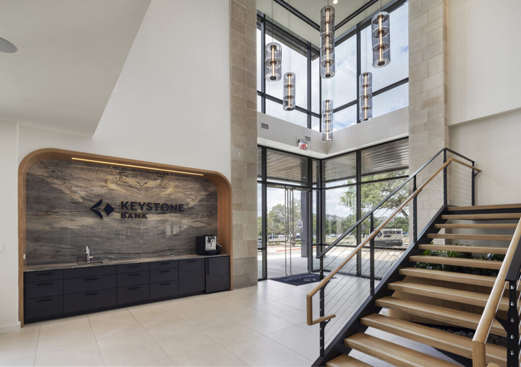
From the start, it was clear that Keystone’s visual transformation would center on elevating the existing logo into a richer, more luxurious brand world. The new headquarters served as a guiding inspiration—its clean architecture, warm materials, and polished finishes shaping the foundation of the refreshed aesthetic. The design direction embraced the qualities Keystone embodies: modern professionalism, confident simplicity, and an approachable sense of sophistication. Every element aimed to resonate with high-net-worth individuals seeking a banking partner that reflects their own ambition and standards.

Services Provided
Brand Refresh and Ongoing Design
The Execution
The Identity
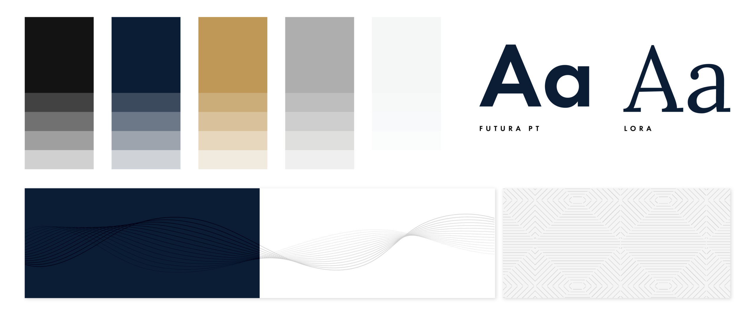
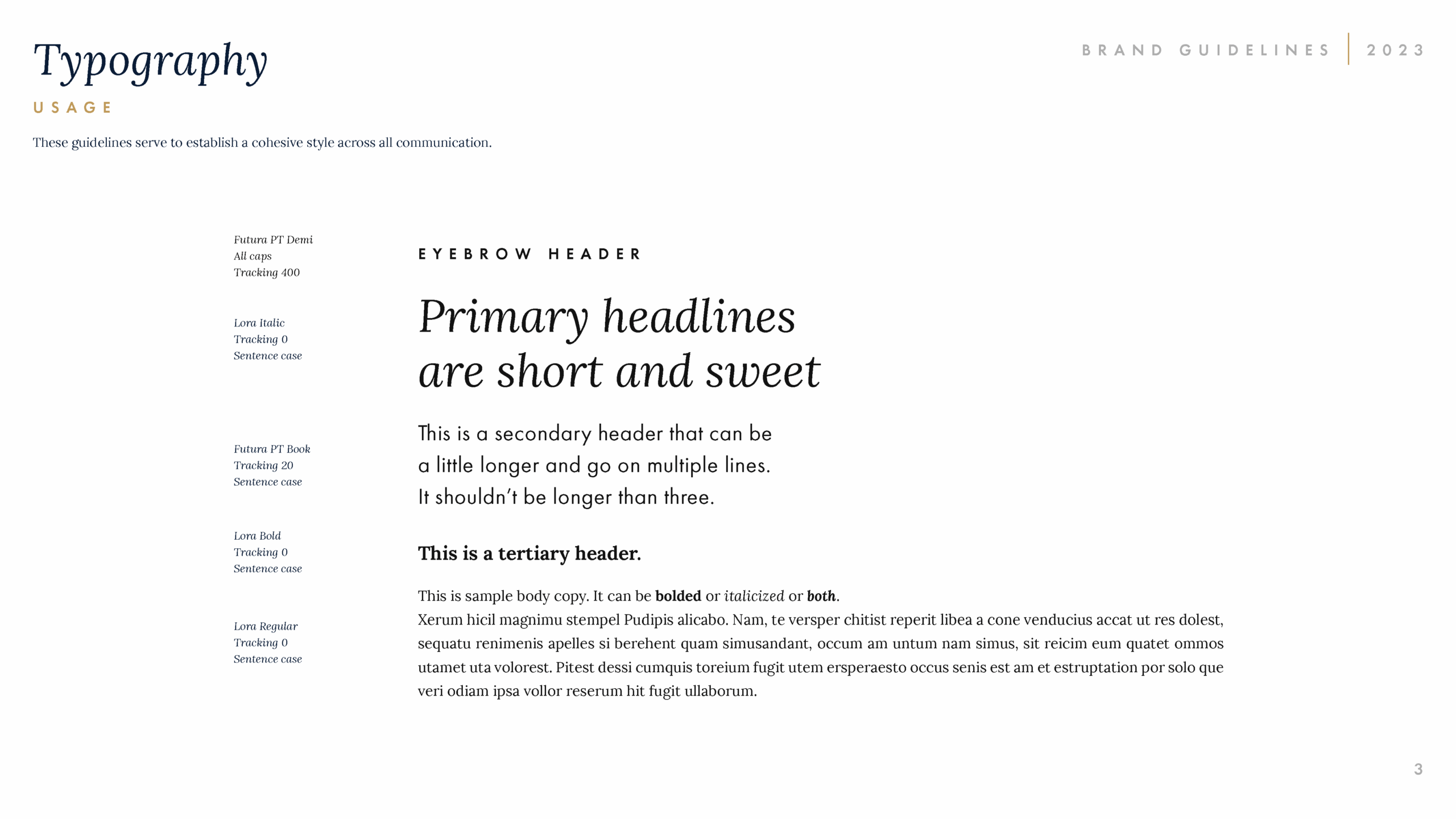
The refreshed palette blends deep navy, charcoal, and warm gold to create a tone of understated luxury—balanced, timeless, and distinctly premium. Paired with a combination of Futura PT and Lora, the typography reinforces clarity, elegance, and a forward-thinking sensibility.
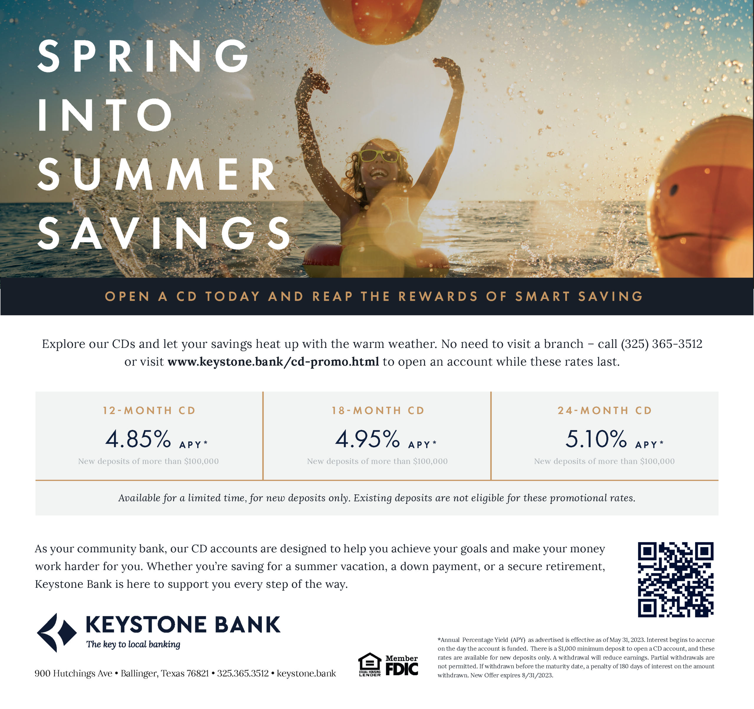
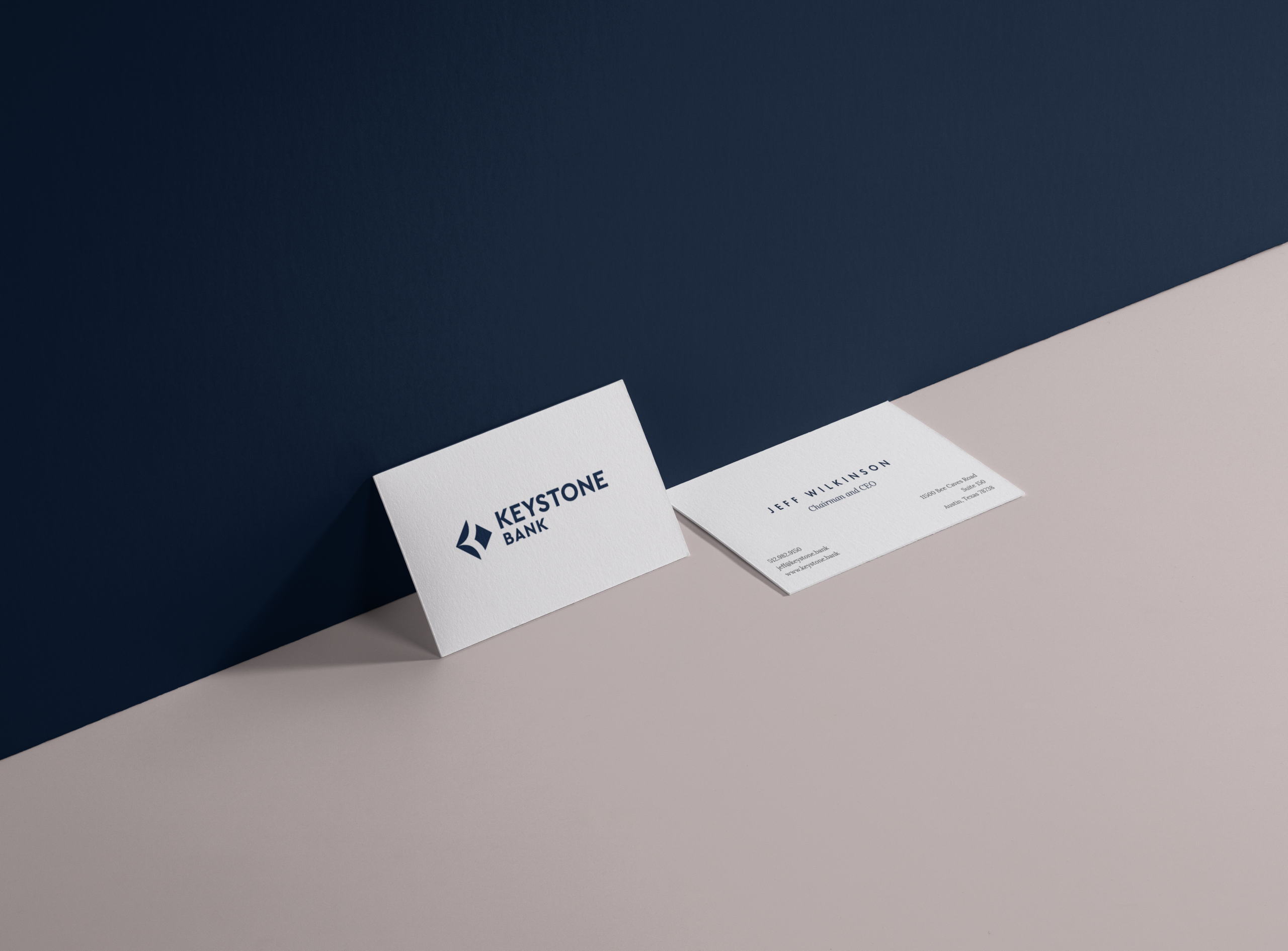
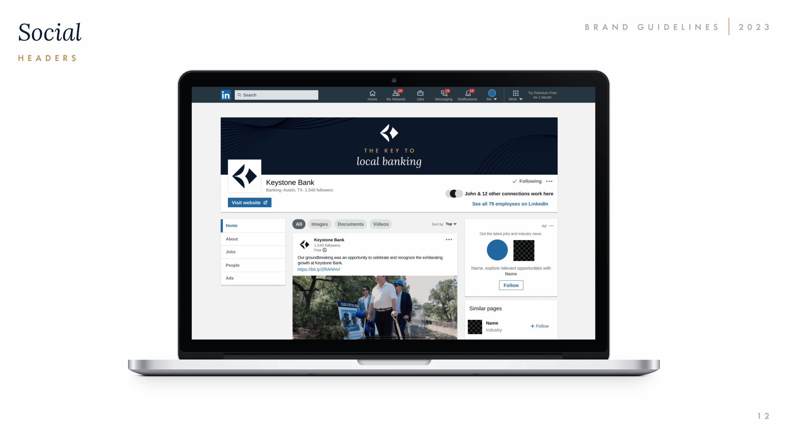
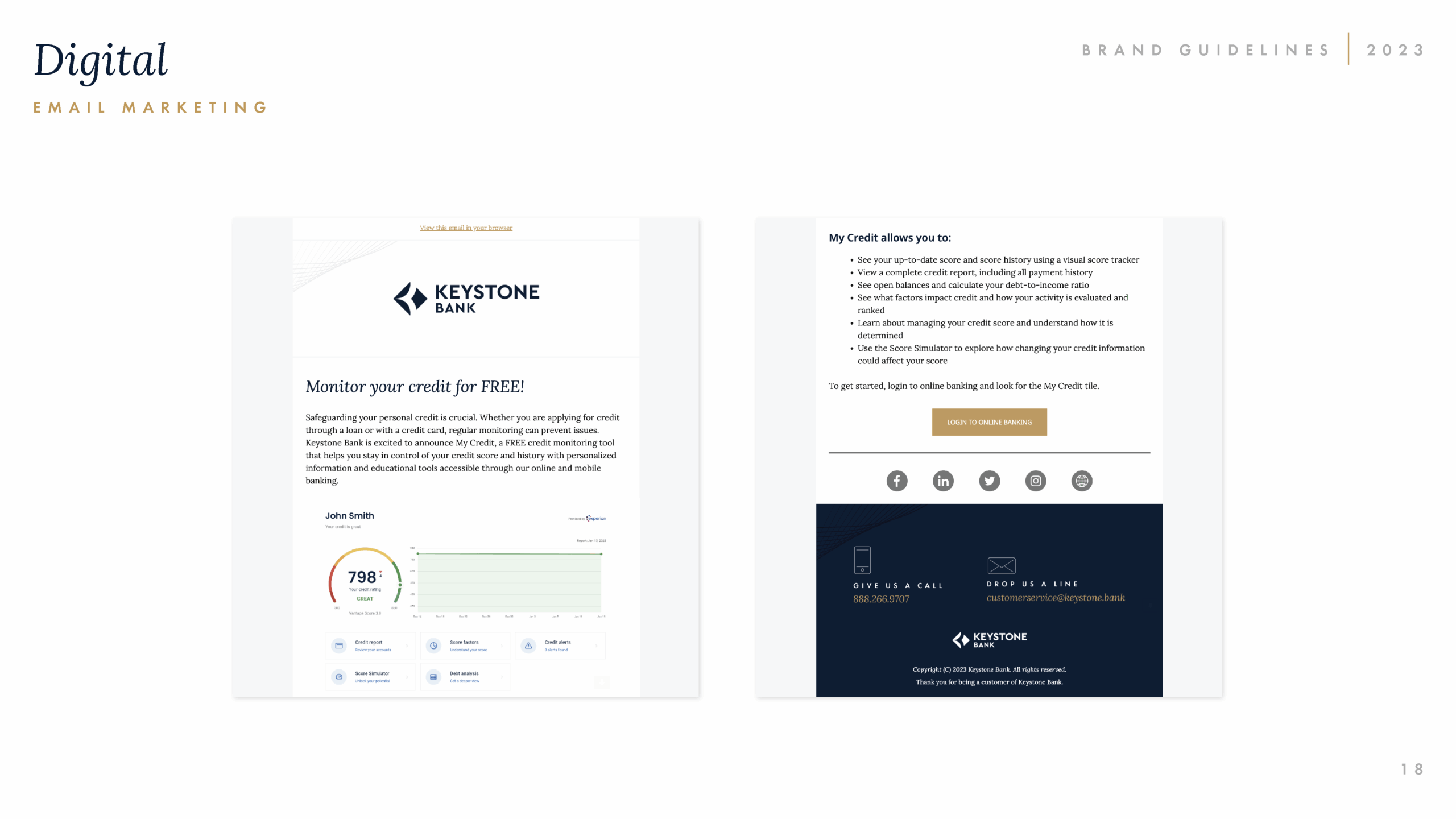
Subtle patterns and curated imagery add depth to the system, echoing the fluid lines and textures found throughout the new headquarters. The identity extends seamlessly across digital platforms, print collateral, and environmental design, unifying every touchpoint under an elevated visual language.
Keystone’s messaging speaks with confidence and clarity, reflecting the bank’s commitment to innovation, personal service, and community-centered leadership. The tone is polished yet warm—authoritative without losing its sense of approachability.
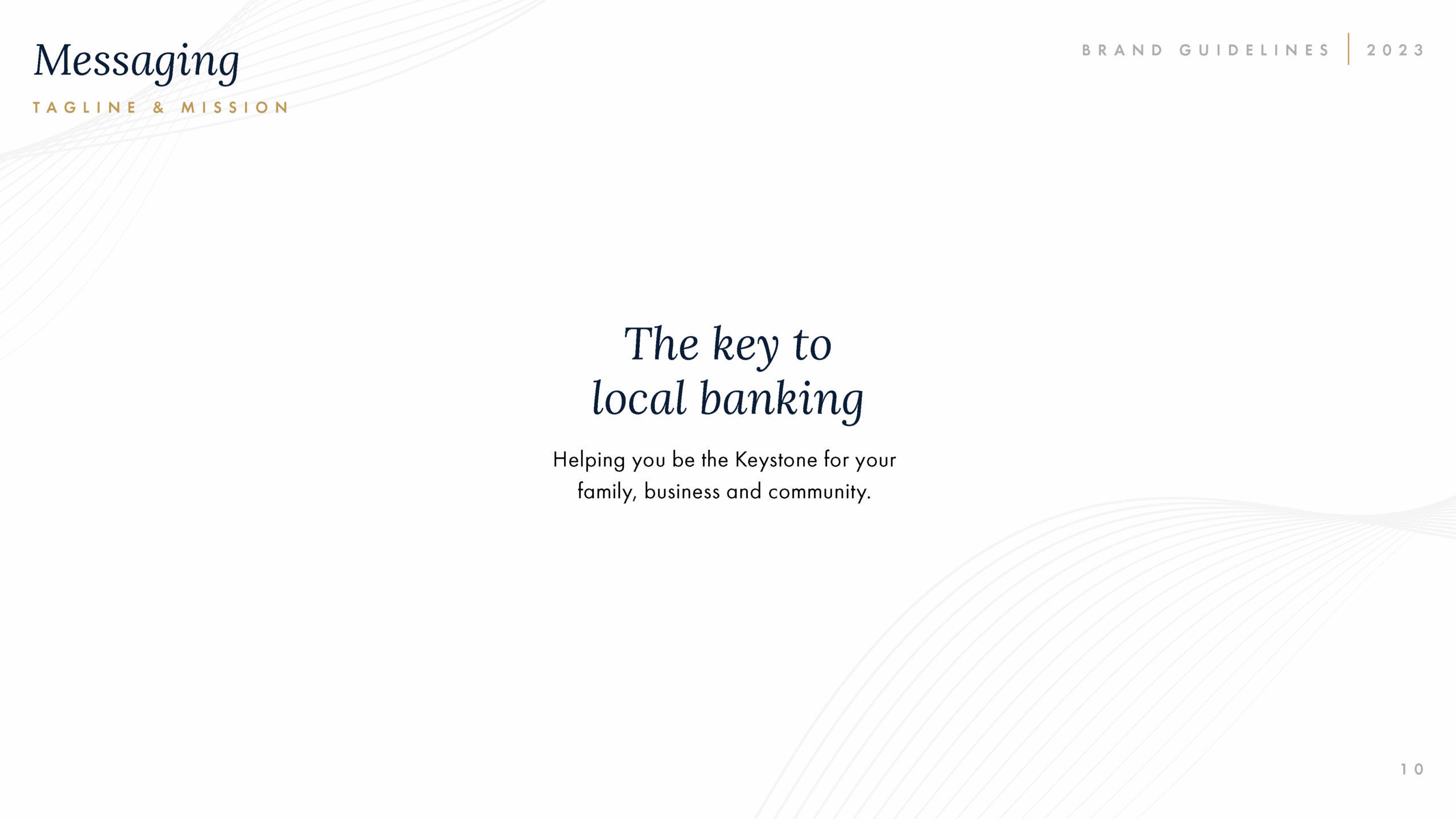
The refreshed voice emphasizes partnership and trust, positioning Keystone as the guide for families, businesses, and entrepreneurs. Anchored by the tagline “The key to local banking,” the message reinforces a brand built on reliability, expertise, and genuine connection.










The Results
Refined Identity
The refined identity launched in tandem with targeted advertising campaigns, generating meaningful momentum and accelerating Keystone’s deposit growth. Within three quarters, the initiative drove $3.7 million in new deposits, surpassing their goal and strengthening its presence in the competitive Central Texas market.
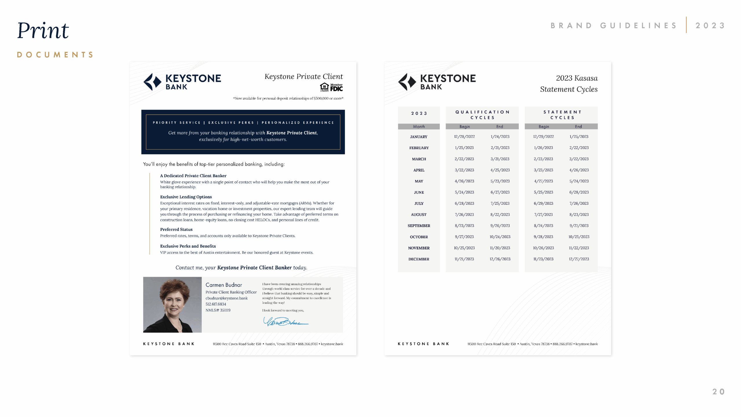
Across six years of partnership, Zilker Media has continued to redesign and refine collateral across nearly every customer touchpoint, providing consistent creative support as the brand evolves. With its elevated unified design system, Keystone now stands as a distinctive, sophisticated leader in community banking.