One of the most critical pieces of collateral in a brand’s arsenal is the logo. The logo is the visual representation of the values and mission of the brand. It’s the first thing people see—it’s on the website, the business cards, maybe even the building! So what happens when your logo no longer feels relevant?
It might be time for a refresh.
Making a change can feel daunting, especially when the stakes are high. A lot can go wrong when redesigning your logo—but a lot can go right too! Let’s take a look at a few major brands that have recently done it well.
Fisher-Price
Fisher-Price’s new logo takes a playful new direction inspired by the new brand mission to “put the fun back in functional.” A clever new typeface and simple geometry go a long way to achieving this. The classic red “awning” has been pared back from four down to three swoops to represent the three founders, as well as the concept that parents plus children equal fun. This refresh is so artfully done that unless you research the old logo, it feels like it’s always been in use.

Discovery Channel
Discovery Channel has moved from an overly complicated design (was that a real photograph of the Earth?) to a concise new logo. The typography is a bold version of the old logo but loses some of the irregularities. For instance, the D is now cut cleanly and leaves just the bowl to let the Earth icon neatly take the place of the stem and make the logo feel like an integrated whole.

Warner Brothers
The Warner Brothers logo is so ubiquitous that you have to take a second look actually to see it. There is liberal use of gradient to make the gold outline of the shield feel realistic and a slim serif font in all caps. The new logo is a breath of fresh air. The iconic shield has been reduced to a flat shape making it easily implemented across platforms. The WB curve slightly to fit perfectly within the shield.

What makes a successful logo redesign? Find what works from the old logo and integrate it seamlessly into the new design. The previous brands did that perfectly: Fisher-Price’s classic red awning, Discovery Channel’s understated new Earth icon and Warner Brothers’ distinct shield.
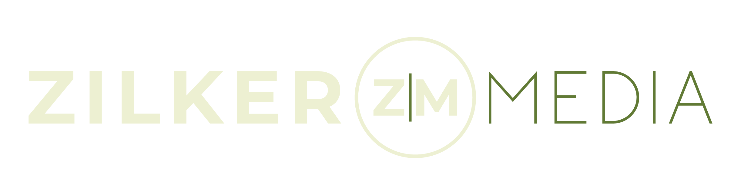
Why did Zilker Media decide to refresh? Let’s get personal.
With the rapid growth we’ve seen over the past three years, we are always thinking about our future and what new opportunities we can enter. It only felt natural to also think about how we are presenting ourselves through this evolution. We love our brand colors and the sans-serif font of “Media,” but we wanted a fresh update that reflected this growth.
“Clean and modern” was the mantra that led us to our brand new logo. The shift to contrasting sans-serif type was a simple change that makes the logo feel fresher and bolder. We combined the new logo with our tagline to create a badge variation (and man, are we excited about the swag possibilities). The badge was a fundamental way for us to introduce a simple symbol that represents who we are: people-centric. By putting the Z|M inside of the circle, it lets our core principles guide our visual brand.
“Our new logo is a natural reflection of our growth at Zilker Media. I love how we have adapted our founding logo to reflect the bold, strong and classic foundation we have built. Under the direction of our Creative Lead Melanie Cloth, I’m excited to have a logo that will bring us into the next chapter of Zilker Media.” – Paige Velasquez, CEO

How to determine if your logo needs a refresh
Redesigning the logo is a huge step to take, but there are a few indicators that will let you know it’s the right time. Here is what we took into consideration, and what we encourage you to think through when making this decision:
- Does your logo express your values?
- Does it represent your team and the work you do?
- Does it look outdated?
- Is it too complicated?
- Does it work in every situation you need?
If you answered “no” to more than one of these questions…it might be time to refresh!
If you’re interested in giving your brand a makeover or have any questions about where to start, please reach out to our team of experts at info@zilkermedia.com!